Sunday, February 5, 2012

Taubman Art Museum

So it's been a while since my last post due to my architecture thesis, but I thought I'd write about a building and lesson learned regarding my thesis research. The site of my thesis happens to be in downtown Roanoke VA, a city with a long history that once thrived on the railroad industry but it now seems to be stuck in place, keeping it as the forgotten step-child of Virginia's other big cities like Richmond, Norfolk/Hampton Roads and those of Nothern Va.


So that brings us to the Taubman Art Museum by Randall Stout, a graduate of the Frank Gehry school of complex forms and pointy edges. Now I have to admit, as in some of my other post, I have never been a fan Gehry and his style of Deconstructivism, but I actually find myself defending Stout's Taubman Museum of Art. The building itself is lucky to have actually even been built with the strict and very public opposition it received from residents and its still a hot topic years after. Now the building itself is nothing like the standard brick masonry facades of the rest of the downtown, but thats exactly what the city needed, a breath of fresh air and a step forward in establishing an identity for the city.


Structure of Pointed Atrium


From Interstate 581, the large pointed glass atrium can be seen by all those passing through the city and makes for an impressive entrance for those exiting off into the downtown.  Open to the south, light shelves are placed inside the glass to help control the light in addition to the coating  on them, helping to regulate the heat gain. The shadows from the steel structure dance across the floor and along the large stairwell as the day progresses, giving the space an even more dynamic feel and making for a nice event space.


Shadows on the grand staircase


 Up the grand staircase to the second floor is where the galleries begin. The galleries themselves are made up of about eight separate rooms but all in all does not seem like a lot in comparison to the size of the building. Nice attention is given to give views of the city from opposite end of the hallway with diffused natural and artificial light light the path through the galleries.


Piano in the Shadows

Perhaps the strongest part of the museum is the use of material and the play of light and shadow. The rustic look of the stone on the back end actually works well with the metal roof and the large glass spans help bridge between the two and give transparency to the architecture. The form itself sets up unique shadows and reflections of itself as well and the surrounding buildings.

Play of light and shadow


So after a few visits to the Taubman, I have actually come to respect it a lot more. It's intentions may not be perfect, but it gives the city something unique and has the potential to draw in passerbys interested by the form. Theres no doubt that it will continue to be a topic of conversation among residents, but hopefully with its completion it marks a transition for the city into a new way of thinking. Tradition and history should be respected but that doesn't mean you should reject new ideas and ways of thinking, something that will hopefully lead to growth and more opportunity in Roanoke.

Wednesday, July 20, 2011

Kogod Courtyard: Art Surrounded by Art

Over the past year, I've had the opportunity to scout out many different types of architecture overseas, but my latest adventure brought me back to a place I am no stranger to and has become a common stop whenever I end up in the Washington DC area. Sheltered within the confides of the National Portrait Gallery in Chinatown, The Kogod Courtyard offers a pace to elude the muggy temperature, occasional rainstorm, or the lively DC streets. The main design consideration of a covered space may be simple, but Norman Foster's idea for a envelope is far from it. Simliar in structure to that of his British Museum addition, an aluminum truss system houses glass panels to create an enclosed space, but like a master conductor, Foster guides the truss system through a series of crescendos and diminuendos, giving movement to the space.


Movement through roof


You begin to wonder how many people pass through the gallery, on their tour of Smithsonian Museums, in search of classical artistry only to miss this center which offers up this piece of modern art. It wouldn't be that hard to do, as the information desks, in all their centrally placed glory tend to welcome visitors by pushing them to the side wings, or the corresponding stone staircases on either side of the door. It's been awhile since I first walked into the space, but I'm still taken by it's large but welcoming scale. It's big, but no where close to overpowering, as the light structure keeps the space open and the marble planters give life to the olive trees and other greenery.


Roof swelling before joining back to the building


The courtyard  is what a public space should be: open, inviting, full of life and lets you experience it differently from unique perspectives. Of course you can always sit at one of the many tables that occupy the area, but one of my favorite ways to utilize the space is laying on the smooth marble planters, cool to the touch, and staring up at the clouds passing over these undulating aluminum supports. The sides of these planters were intentionally oversized allowing them to be inviting instead of just another boarder around some greenery. On a hot day, it's not uncommon to see more people resting here, instead of one of the many chairs, looking up through the branches of the olive trees as their leaves sway with the ventilation of the building. These trees keep the space feeling fresh and allow contrast between the industrialized columns, ultimately creating a space in-between.

Modern meets Organic


Sure, you could pick up a flyer at the information desk and read about the recycled denim used to insulate the trusses, or have one of the people at the desk explain to you how the reflecting pools were removed due to numerous leaks, but this is a space that yearns to be experienced and not told. Good architecture can tell you story...and the Kogod Courtyard does so by using the shadows moving across the walls, the resident trees growing even closer to the limit and rewarding the average passerby that takes the time to stop and look up.


Through the Trees
More mages available of flickr

Saturday, May 7, 2011

Cardinal Belluga Square, Mixing Modern with Classical in Murcia

When first entering Cardinal Belluga Square, it feels a lot like any other Spanish plaza with its small shops, cafes with outdoor seating, street performers, and bustling foot traffic. The one thing that sets this plaza apart from others is you may happen to wander into is the mixed uses of the buildings that take up their residence in this area. The first structure to stand out is located on the long axis of the plaza, a great cathedral built in the seventeenth century with a Baroque facade complete with heavily ornate statues and details. It is an overpowering structure in such a small plaza. Its design makes it stand out and automatically draws ones attention when they enter into the space. 


Murcia Cathedral


Taking up the area on the opposite end of the square is a modern building, Murcia Town Hall designed by Rafael Moneo. Moneo had the difficult design task of creating a building for the city hall that stood in direct opposition to one of the most overpowering structures in the plaza and one of the best churches in Spain. He incorporates a design based on a modern day baroque philosophy in order to both respect the pre-existing building and to not overpower the square by competing with such a classical order.


Moneo's City Hall of Murcia


The new construction is more of a response to the cathedral instead of trying to be the definitive answer to the design problem Moneo had to work with in placing a building in such a historic plaza. His modern day baroque stands with a minimal facade with no ornament standing in opposition to the church. A series of openings make up the face which seem to be spaced out in a geometry that responds to the placement and decor on the facade of the cathedral. This leads to the town hall having a very simple exterior but allows shadows to play within the voids and the frames of the openings to create a more dynamic feeling than what is originally presented. This allows the building to go through transitions throughout the day without over doing it. There is also no entrance to the building located on street level in an attempt to not draw attention away to the other sites. The base of town hall extends one level below to the street level to give the appearance of it rising up and not creating a harsh connection with the street, once again in an attempt to not try and compete with its surroundings. The stance of only trying to respond to the situation instead of trying to find a definitive answer works.  It is a difficult situation given the circumstances and should be credited to Moneo. You never get the feeling that these two buildings are in opposition of each other and trying to compete within the small plaza. The cathedral remains the focal point with city hall taking the backseat but still getting its architectural intentions across in a respectful manner.

One of the other important design considerations can only been taken into account when you look down and observe the spacing of the tiles that form a grid laid stretching across Cardinal Belluga Square. Pathways are created with the use of lighter colored stone tiles set within the darker pigmented ones that make up the majority of the plaza. This pathways at first glance might not seem to have anything other than an arbitrary layout intending to give movement to the group, but on closer inspection, you realize they connect to the different entrances of the surrounding architecture. The paths end at the doorways to the shops and church on the short axis as well as at city hall and the three portals to the cathedral. This design consideration directs movement within the space and gives direction in a busy atmosphere. It’s interesting just to sit and observe  the number of people that will take the time to move over onto these paths as if it is guiding the direction they are traveling. These paths become a street within the open space to direct the flow of foot traffic throughout the square. The culmination of these multiple paths happen at the intersection of all of them, creating in a sense a grand stage. It is a space where the journey of seven different paths come together and give union to the center of the square although not the absolute one. This point becomes a stage where groups meet even though they are coming from a different direction with different intentions. It is a way to bring people together and not necessarily make it obvious why until you look at the ground. The street performers like it best to set up shop here as it is the point where anyone who enters the plaza will surely pass through. It is important and works because it takes something that most designers overlook and gives it a purpose within the space. A  ground plane that not only directs but brings you through the space and all the time has the power to bring strangers together without forcing it.


Not all of the city’s residents  supported the decision to build the town hall in Cardinal Belluga Square, but Moneo tried to stay respectful to the location while offering up a building that could speak for itself. Located just off the busy city streets, Cardinal Belluga Square offers a little something for everyone and  gives a modern influence to the city. The attention still remains very much on the cathedral as you enter the space but the attempt to modernize deserves it’s recognition. Cardinal Belluga Square is a successful example of a public space, because it brings together tradition with a sense of advancement and moving forward while taking into account the needs of the residents and the flow of everyday life.

Sunday, March 20, 2011

Into the Light: Calatrava and Foster Libraries

In coming up with a design for their new libraries, two of today’s leading architects, Norman Foster and Santiago Calatrava, faced similar issues in placing their modern buildings into pre-existing conditions, but both may have looked into the past for their natural light-filled masterpieces. Norman Foster’s Philological Library sets in the middle of a small courtyard in the Free University of Berlin and connects different wings of the surrounding buildings. The library has been nicknamed the “Brain of Berlin” because of this and the fact that it sets centrally on campus. Santiago Calatrava’s Zurich Law Library is nestled within a historical building downtown within the city’s University, an area that was once defined by the large city walls that used to protect it. Although both architects had to deal with the constraints of working on a small site already surrounded by older architecture, that is not where the similarities stop. Both architects main idea for their libraries focus on a play of light and getting as much natural light into the space as possible in order to create a well lit working environment. In Louis Kahn’s Exeter library, light also played a critical role in the layout of the library and may have been an contributing example that both modified to be put in use by these modern structures. Kahn believed that one should be able to make the selection of the book they wanted and then be able to step into the light. Both Foster and Calatrava use this philosophy by having the book shelves protected from the natural light but allowing the reader to easily be able to move back into the light to work. The diffusion on this natural sunlight plays a big role in each library, but the architects go about this process in a different way. Foster chooses to have natural light on all sides of the building while Calatrava uses a central atrium with light coming from overhead. Although they may have gone about this in different ways, both work very efficiently in both plan and section to allow for well lit work and reading spaces, protection for the books from harmful sun rays and a sense of openness in a location that once felt closed in. These spaces have now been transformed into a open space full of life where students and faculty are able to gather and not feel like they are in a closed in and just going through the motions of another library.

Collage of Foster's Philological Library


Foster uses a structural system in the Philological Library that consists of  two different shells connected together for support, rather than using columns, to open up the space without congesting it with structure. The outside shell consist of a pattern of metal panels and transparent glass that allows for outside light to penetrate the structure from all sides. The second layer, the interior, is made up of mostly translucent panels that help to control day lighting and glare. This shell also has panels of transparent glass in strategic locations to allow glimpses of the outside and reveal how the two shells are held together.  These structural members vary in size and are cladded in yellow, a stark contrast to the mostly white frame, much like the entrance portals to the library. Not only does the two layer system help to supply natural light to the library without excessive glare, but also acts as a natural heat buffer and regulates the temperature. Side panels on the exterior shell are designed to pull out, while those on the interior push in to allow for air flow through the building. The floor plan for each of the library’s upper three floors is derived with the respect to the floor(s) above it. The serpentine edges of the floors curve back and forth to not only create a dynamic feel to the layout, but also to reveal the floor below it. 

View of Different Floors in Philological Library

This ultimately allows for the flow of uninterrupted, diffused lighting horizontally and vertically from the ceiling and resulting in the bottom floor being the largest and the top is the smallest. On each level, the bookcases are found under the floor above it, with desks along the flowing edges. This design allows the books to be kept out of any natural light, while the work spaces are well lit by the abundance of diffused light from the main open space. To further maximize the openness of the space, each floor is sectioned into two areas connected by a central staircase.  This allows the view from the entrance to the ceiling to remain open until you reach the staircase. The brain analogy is a useful one in that the light is not centralized but spread all over the library with the whole space being active in the play of light. It coordinates the entire space and opens it up to different activities in varying locations, allowing it to be an effective way of utilizing the space and not just another dull library experience.

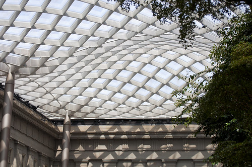
Looking Up Through Calatrava's Law Library

Calatrava’s use of steel as the main structural element is still very much present in the Law Library, but it takes a back seat to the more natural materials, such as the wood used in the six concentric rings that make up the different levels. The metal, cladded in white, frees up the plan and the rings are supported on both ends of the library by two service cores that face each other and serve as the circulation for the different floors.  

View of Different Floors in Zurich Law Library

On the shorter sides of the rings, the structure is hung on a single tensile member that runs down the six levels uninterrupted.  The use of such a minimal support system along with the choice of white cladding creates a sense of lightness and that the structure is floating within the room. The rings are based on a bent truss system that connects to the service cores on the end. These trusses have multiple ribs that add to the structural integrity of the floors and eliminates the need for support in the center atrium. The large atrium space is supported by a large curving, wing-like beam that stretches from end to end. This creates vertical movement in the space by reflecting the natural light down into the space, resulting in the void being filled with light. The plan of the Law Library is also dependent on this central light source.  Each of the six different rings are positioned in the plan to be able to absorb the most natural light at it’s edges, and gradually diffuses as one steps away from this illuminated axis and into the bookshelves. This again seems to address the issue of movement when a person makes their selection and where they eventually end up. Calatrava keeps the illuminated core central, making it the meeting point of the library and allows patrons to interact with each other in one common area, creating a more condensed workspace. Each of the different levels share a similar floor plan that consist of a ring of built in desks with parallel book cases along the long axis. The typical lines of book cases make up the rest of the plan until the outside wall and are artificially lighted as the natural light filters out. The light from above creates a space that seems to dissipate into the floors below it until it reaches the ground, letting the library be powered by this lighted core and allowing for the everyday functions of the library to be carried out. A centralized core is felt throughout the plan by letting light spread out.