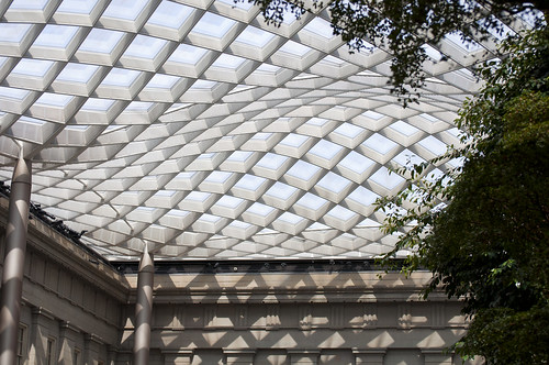
In coming up with a design for their new libraries, two of today’s leading architects, Norman Foster and Santiago Calatrava, faced similar issues in placing their modern buildings into pre-existing conditions, but both may have looked into the past for their natural light-filled masterpieces. Norman Foster’s Philological Library sets in the middle of a small courtyard in the Free University of Berlin and connects different wings of the surrounding buildings. The library has been nicknamed the “Brain of Berlin” because of this and the fact that it sets centrally on campus. Santiago Calatrava’s Zurich Law Library is nestled within a historical building downtown within the city’s University, an area that was once defined by the large city walls that used to protect it. Although both architects had to deal with the constraints of working on a small site already surrounded by older architecture, that is not where the similarities stop. Both architects main idea for their libraries focus on a play of light and getting as much natural light into the space as possible in order to create a well lit working environment. In Louis Kahn’s Exeter library, light also played a critical role in the layout of the library and may have been an contributing example that both modified to be put in use by these modern structures. Kahn believed that one should be able to make the selection of the book they wanted and then be able to step into the light. Both Foster and Calatrava use this philosophy by having the book shelves protected from the natural light but allowing the reader to easily be able to move back into the light to work. The diffusion on this natural sunlight plays a big role in each library, but the architects go about this process in a different way. Foster chooses to have natural light on all sides of the building while Calatrava uses a central atrium with light coming from overhead. Although they may have gone about this in different ways, both work very efficiently in both plan and section to allow for well lit work and reading spaces, protection for the books from harmful sun rays and a sense of openness in a location that once felt closed in. These spaces have now been transformed into a open space full of life where students and faculty are able to gather and not feel like they are in a closed in and just going through the motions of another library.
 |
| Collage of Foster's Philological Library |
Foster uses a structural system in the Philological Library that consists of two different shells connected together for support, rather than using columns, to open up the space without congesting it with structure. The outside shell consist of a pattern of metal panels and transparent glass that allows for outside light to penetrate the structure from all sides. The second layer, the interior, is made up of mostly translucent panels that help to control day lighting and glare. This shell also has panels of transparent glass in strategic locations to allow glimpses of the outside and reveal how the two shells are held together. These structural members vary in size and are cladded in yellow, a stark contrast to the mostly white frame, much like the entrance portals to the library. Not only does the two layer system help to supply natural light to the library without excessive glare, but also acts as a natural heat buffer and regulates the temperature. Side panels on the exterior shell are designed to pull out, while those on the interior push in to allow for air flow through the building. The floor plan for each of the library’s upper three floors is derived with the respect to the floor(s) above it. The serpentine edges of the floors curve back and forth to not only create a dynamic feel to the layout, but also to reveal the floor below it.
 |
| View of Different Floors in Philological Library |
This ultimately allows for the flow of uninterrupted, diffused lighting horizontally and vertically from the ceiling and resulting in the bottom floor being the largest and the top is the smallest. On each level, the bookcases are found under the floor above it, with desks along the flowing edges. This design allows the books to be kept out of any natural light, while the work spaces are well lit by the abundance of diffused light from the main open space. To further maximize the openness of the space, each floor is sectioned into two areas connected by a central staircase. This allows the view from the entrance to the ceiling to remain open until you reach the staircase. The brain analogy is a useful one in that the light is not centralized but spread all over the library with the whole space being active in the play of light. It coordinates the entire space and opens it up to different activities in varying locations, allowing it to be an effective way of utilizing the space and not just another dull library experience.
 |
| Looking Up Through Calatrava's Law Library |
Calatrava’s use of steel as the main structural element is still very much present in the Law Library, but it takes a back seat to the more natural materials, such as the wood used in the six concentric rings that make up the different levels. The metal, cladded in white, frees up the plan and the rings are supported on both ends of the library by two service cores that face each other and serve as the circulation for the different floors.
 |
| View of Different Floors in Zurich Law Library |
On the shorter sides of the rings, the structure is hung on a single tensile member that runs down the six levels uninterrupted. The use of such a minimal support system along with the choice of white cladding creates a sense of lightness and that the structure is floating within the room. The rings are based on a bent truss system that connects to the service cores on the end. These trusses have multiple ribs that add to the structural integrity of the floors and eliminates the need for support in the center atrium. The large atrium space is supported by a large curving, wing-like beam that stretches from end to end. This creates vertical movement in the space by reflecting the natural light down into the space, resulting in the void being filled with light. The plan of the Law Library is also dependent on this central light source. Each of the six different rings are positioned in the plan to be able to absorb the most natural light at it’s edges, and gradually diffuses as one steps away from this illuminated axis and into the bookshelves. This again seems to address the issue of movement when a person makes their selection and where they eventually end up. Calatrava keeps the illuminated core central, making it the meeting point of the library and allows patrons to interact with each other in one common area, creating a more condensed workspace. Each of the different levels share a similar floor plan that consist of a ring of built in desks with parallel book cases along the long axis. The typical lines of book cases make up the rest of the plan until the outside wall and are artificially lighted as the natural light filters out. The light from above creates a space that seems to dissipate into the floors below it until it reaches the ground, letting the library be powered by this lighted core and allowing for the everyday functions of the library to be carried out. A centralized core is felt throughout the plan by letting light spread out.